The freezing of Arctic and Antarctic waters is a seasonal pulse of our planet. The maps below show ice extents, per month, since 1979.

This map shows 40 years of sea ice extents, color-coded by month . It’s interesting to see the oscillation between the opposite seasons of the North and South Poles. As the ice at one end of the earth expands, the other side recedes.
This is helpful for understanding the annual tug of freezing and thawing through the poles’ seasons, but we don’t see how the sea ice extents may have changed over the 40 year period. So instead of coloring by month, let’s color by year…

Lots going on. Here’s a version that includes individual month cross-sections through the years.

Here are those month cross-sections as a seasonal animation…

While the animation helps show the seasonal dynamism of sea ice, and the retraction of arctic ice in recent years (yellows) is pretty dramatic, you might want to hit pause and take a close look, at these frames. Why not?

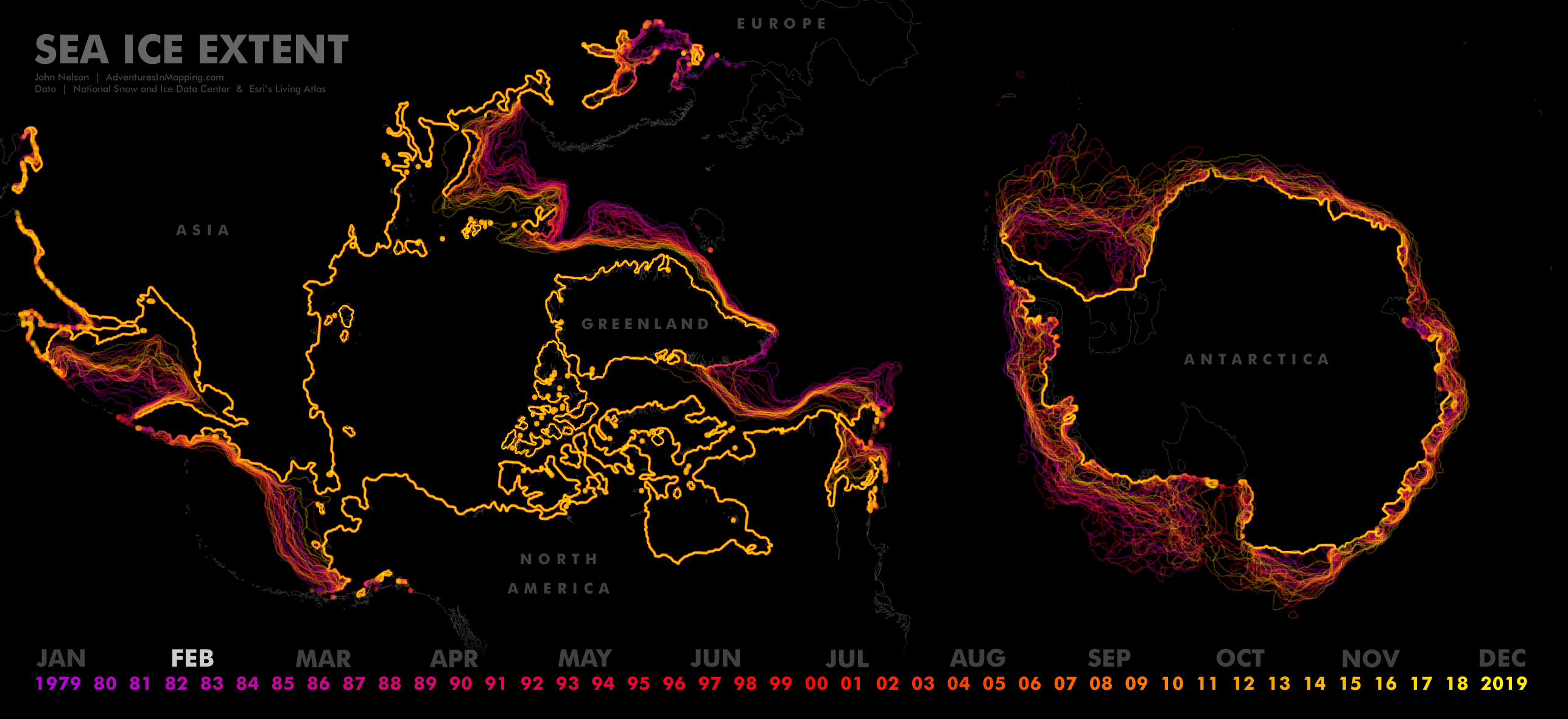


The data comes from the Living Atlas (Arctic and Antarctic sea ice extents, each month, since 1979), based on satellite-derived bounds provided of the National Snow and Ice Data Center.
Otherwise, awesome!
Amazing Job. Keep it up.