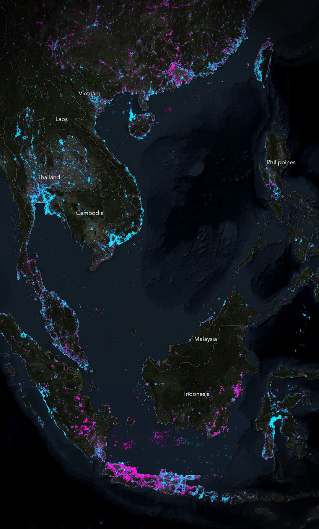
As a follow-up to last week’s visualization of Old Light and New Light, I wanted to make a single map, of the whole world, comparing NASA’s new 2016 Earth At Night image to the 2012 version. Using a simple pixel-difference math bot, this map isolates places where lights have come on (or increased) and where they have gone off (or decreased) in the past five or so years.
To explore this map in more detail, with a closer look at interesting locations and the presumed causes of changing nighttime lights, including a walk-through the creation process, visit this story map.

New light is blue and extinguished light is pink. Places that haven’t changed (lots of places have no nighttime light to begin with, and others, like the center of big cities, were bright before and after) are transparent so you just see right through to the satellite background.
There are lots of interesting changes to the nighttime sky in these last recent years. Some optimistic and exciting, and others terribly sad.
In the map’s text I lay out some hunches for what might cause lights to come on in some places and some reasons I suspect for lights that have been extinguished.
Some reasons for new nighttime illumination are suburban growth rings around existing urban centers, the new electrification of rural areas, wellhead fires in areas of new petroleum extraction, or waters newly popular with fisheries.
Some reasons for dimmed or extinguished nighttime illumination are the preventative measures taken to reduce nighttime light pollution, the contraction of populations from economically struggling areas, the abandonment of petroleum fields or fisheries, or the collapse of population or infrastructure due to war or social upheaval.
Here are some areas I thought were particularly interesting. Each has a story. Please do let me know if you have insights into the reasons for any of these changes in nighttime illumination. I’d love to learn more about the causes.


If you’re a mapping nerd like I am, you’ll want to know how these were made. Check out the specific how-to process here.
Happy mapping, John
Venezuela’s infrastructure has been breaking down at an accelerated pace, and it’s well-documented that it suffers crippling brownouts every so often for the last few years. I am not surprised to see a lot of lights dying, although it IS striking to see. I’m way more curious about what the new lights are all about. New construction has been minimal for a long time.
I agree, it is interesting to see some new lights in Venezuela. They are very concentrated, though. Might they be petroleum extraction, or some other big construction project?
Brilliant. Paints a pretty bleak picture of Syria (and northern Iraq), showing the effects of conflicts there (ISIS etc.). Why are so many lights off in the US? I’m a Southern Hemisphere dweller so was a bit surprised by it.
I was surprised by how pink the US and Europe was, too. Maybe some of it has to do with more efficient LED lighting?
More efficient LED lighting would actually increase the amount of brightness of a city. The amount of light needed to light up a street does not depend on the efficiency. Sure an LED will make it cost less but you’ll still require the same brightness to light up city streets.
LED light has more blue component compared to sodium lamps which are more red.
Short-wavelength (blue) light scatters a lot further through the atmosphere than long-wavelength light (red). So LED lighting will make the sky-glow worse even if the total amount of light-units installed remains the same
¯\_(ツ)_/¯
I’m not sure how these images were compiled, but maybe there’s some disparity due to the time of when the photos were taken?
For instance, during the week versus the weekend? Or perhaps in the winter vs summer? More pleasant weather and longer days might mean more/less lights being on?
The picture of Texas (specifically San Antonio) shows a near total change for the entire metro area. That would be an insanely drastic change for just 4 years.
Good questions. I wondered it, too. Maybe it’s some variability that is hard to isolate between years? Maybe improved/efficient lighting or Dark Sky initiatives? I don’t know. Here’s some background in the NASA processing: https://earthobservatory.nasa.gov/NaturalHazards/view.php?id=90008
This is beautiful work, John. Speaking of stories, the significant increase in illumination we see for India is because of a major effort taken up by the government to provide electricity where it was not earlier available, as well as provide it 24/7.
The NatGeo report that brought me here had this to say – “That India has brightened dramatically, as shown by all the blue in the image below, is also not a surprise. The country is home to more than its fair share of people living without electricity, and its government has been working to change that by establishing a rural electrification program and investing heavily in renewable energy. There is still a lot of work to be done, but the results are already easy to see on Nelson’s map.”
Thank you.
Love your work! Would you mind to share your maps in higher resolution? I’d love to check some other areas.
Thanks.
Thanks Michael! Here is a link to a revised version. It’s pretty big. https://adventuresinmapping.com/2017/05/26/brighter-dimmer/
Brilliant stuff John! As part of McKinsey & Co’s research arm, Mckinsey Global Institute, we are trying to understand this pattern for India and trying to link it with job creation, etc. We are working on it and will have something to share in the next couple of days. One request – for us to understand the pattern clearly, we want to map the India image with relevant states and cities in the country. For this, we need high resolution image of India map. Possible for you to share the same/suggest an alternative?? Of course, we will acknowlege it in our global report in full glory which is coming out later this week. Look forward to hearing from you. Bit of a rush!!!
India’s is a remarkable change. I’ve sent an email.