Occasionally, you might want to give a map label a bit of a dynamic, dimensional, feel. Here is a technique I’ll use from time to time.
Basic solid text…

A copy of the text pasted behind, colored black, and given a Gaussian blur (looks like a dropshadow, but we’re not done yet)…

The blurred text is distorted using an envelope transform. The size and direction of the distortion are eyeballed depending on the directionality, implied bend of the underlying map, or imaginary pseudo-light-source…

Which looks like this…

To soften the farther edges of the blurred text, I give it a linear gradient that fades more to transparent the further it travels from the topmost text label…

Which looks like this…

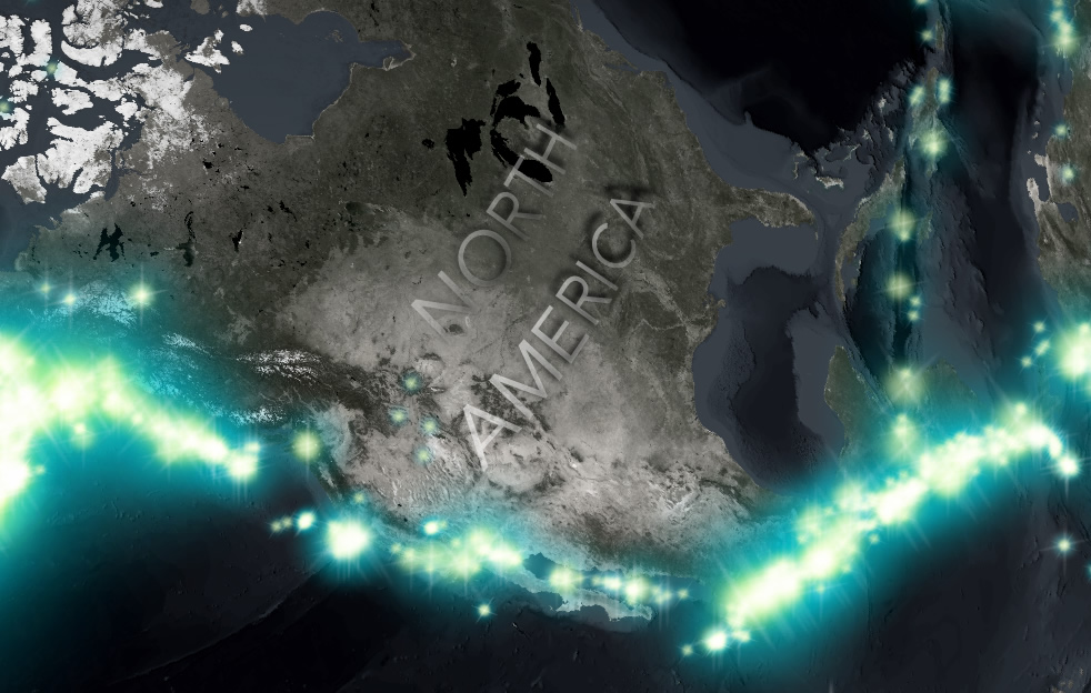
Then I do something similar to the original topmost text. This gives is a little bit of an ethereal I-don’t-know-what…

Which looks like this…

If the labeled feature is large enough, I like to align it to the globe graticule directionality…

And when it comes to large labels of large features, letter-spacing is your friend…

In a map full of large and small labels with this sort of treatment makes maps look a little bit touchable. Like they’ve been carved from something real and reflect light and cast shadows in a manner like a living and dynamic thing that’s been suspended for a moment. And if people are tempted just a little bit to reach out and touch your maps, then you’ve engaged an audience. An engaging map is where the fun happens.
Love this, but can you clarify which software you are using (I’m assuming ArcGIS Pro)?
The Gaussian blur and envelope distortion were done in Adobe Fireworks (though could just as well have been done in PhotoShop or Illustrator).