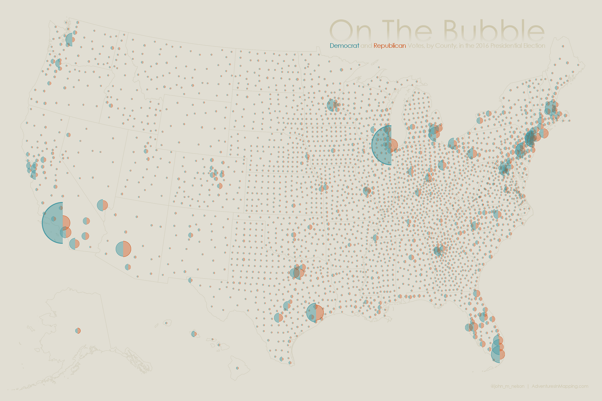
Here is another look at the 2016 presidential election. This map uses adjacent proportional semi-circles to directly compare the number of votes between two parties. This head-to-head method is a bit better at reducing the symbol overlap issue of a standard proportional map that uses co-incident full circles. There’s enough overlap issue in this map as it is.
Here’s a rundown of how to make a map like this. The example, however, uses the much more interesting data of pro vs. college basketball TV viewership (surprisingly similar to election data, it turns out). Same process though.
I foolishly thought I invented this, until Cooper Thomas sent me this article by Cynthia Brewer from 1998. There is nothing new under the sun.