Recently, at the nacis 2016 conference, I enjoying the presentation by Michael Higgins, of Summit Terragraphics, describing the process of making thermoformed raised relief maps (cool 3D vinyl maps) -and even got to handle one. Then, I saw this picture from Tom Smedley, of a wall-mounted 3D map installation at Gettysburg.

I love these things. They are real. Little models, but real -touchable. I tend to stand and stare at them whenever I find one, drawn into the miniature world they depict.
And I got to thinking, hey, I bet I can sort of fake that look using an “aspect” terrain layer in ArcGIS Pro. I then had to try.
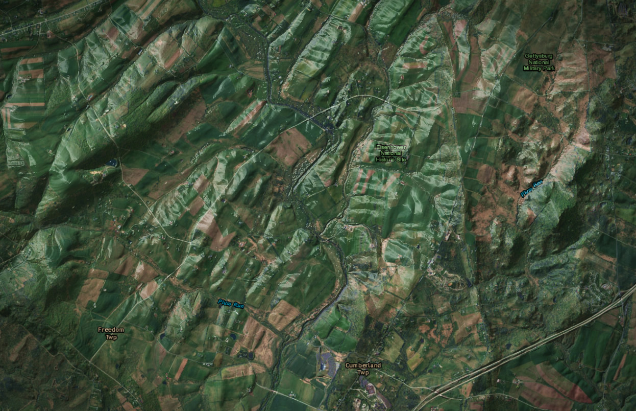
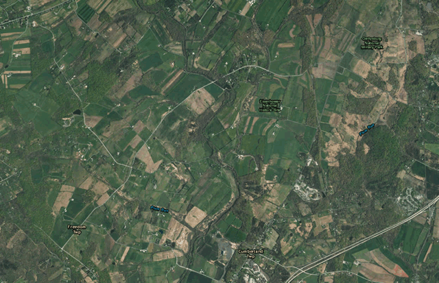
Here is a snapshot of the Gettysburg area, with a satellite basemap.

I pulled in a hillshade layer, and re-colored it so that only the shadows had opacity. This replicates the stark bumpiness of a 3D museum map hanging on a dimly-lit wall.


This is the gradient I used for my shadows (yours might have to be different, based on how rugged your area is. Assuming black for all color stops…

Position | Transparency
0% | 10%
10% | 10%
65% | 30%
75% | 100%
100% | 100%
Speaking of lighting, the most prominently tactile attribute of these maps is their stark reflective surfaces (plaster? vinyl?). There was clearly an overhead light when Tom snapped his picture of the Gettysburg map, above. So I searched the Living Atlas for an aspect layer (aspect is an image overlay that colors pixels by what direction they are facing, based on DEM data). I painted Northwest-facing sides white, and faded to fully transparent the other directions.

This is the gradient I used on the aspect for the plastic-y reflectiveness effect. You can shift the stops one way or the other to tweak the angle of your fake light source. Assume white for all color stops…

Position | Transparency
0% | 100%
70% | 100%
80% | 80%
84% | 60%
86% | 60%
90% | 80%
100% | 100%
That’s it. A silly way to make real imagery look fake, and therefore real, by making it look like fake imagery trying to look real. Yes.
Couple tips: Render the hillshade and aspect layers on top of any label layers, so the labels look like they are painted onto the surface and also impacted by the lighting conditions. I also added a vignette, because that’s what happens in real life when you take a picture of a surface like this in lighting conditions like this.
Here’s a before/after:
Happy reality through fakeness mapping! John
Thanks for sharing this concept! I have been collaborating with some friends in making a little web map toy-thingy, and I might use this.
Awesome! I’d like to see how it comes out, regardless.
Awesome map! I have tried to make the same map in my local area using Arcgis Pro. But I can’t tweek with the symbology in the aspect layer. It default shows RGB. Do you use Stretch symbology and then the color scheme editor?
Yes, exactly!
That’s what I believed. But in stretch I only get these strange symbols on screen. It may be I have som preferences wrong. Should have a screenshot posted of it!
Nevermind! I had the wrong aspect layer from Living Atlas:) It now works perfectly. The Norwegian National Road Administration just lost 1 work hour from me:)
Great! I’d love to see what you make of it. Norway is particularity well-suited for this visualization trick.
Did you see that Norway is the happiest of countries? https://nation.maps.arcgis.com/apps/Cascade/index.html?appid=5a333512e79c4c5ab9052c9d0ff8f55b