My favorite cartography conference is coming up this week, and in advance, I’m getting my presentation materials online. So here!
The topic is “Firefly Cartography” which is a made up thing. I’ll describe it, talk about how it may be an effective grabber of eyes, and how those qualities also make it a helpful technique for education. Because, if something isn’t good for teaching, what good is it?
Firefly Cartography
Firefly cartography (or glow-maps, overproduced tripe, whatever you like to call it…) has a pretty tight set of characteristics that converge to deliver a pretty standard effect. I can say this with confidence because I am making up the name and applying it to these characteristics. Generally, a firefly map has a…
-
Dark, de-saturated basemap (usually imagery)
-
Masked highlight area and vignette
-
Single bright, glowing, thematic layer
I started making them around 2012, but others were probably doing similar things long before me.


Capturing Eyeballs
Firefly cartography tricks normal people into realizing how much they like maps.
Why? what is it about this aesthetic that tends to earn a second glance? I have a few purely speculative ideas…
Cinematic Effect (affect)
This sort of map looks a bit like what you might see on the overhead monitors of intelligence officers or hackers in a dimly-lit command center in a thriller. Now, people may be attracted to this style because of that familiarity, or they are familiar with them because digital set designers make stuff that looks attractive. Cart/horse, but either way, there is a distinct Jason Bourne vibe these maps put out.

Clarity of Theme
Sadly, many maps just have way too many themes (different than lots of data) going on all at once to be attractive at a glance (or all that useful even with careful study). Maps that inspire and get passed to friends tend to have a tight focus in topic. A map without an inherent elevator pitch, a dozen thematic layers, and cascades of shapes and color will have a difficult time engendering reader enthusiasm.

They Glow!
A firefly map is to regular thematic maps the way that a lightsaber is to swords. Thematic layers that look like they are etched with white hot plasma tend to draw eyeballs and provide a sense of intensity that solid Boolean symbology just doesn’t offer. I think we are wired to notice and note things that glow. Whether it is marking time by the sun or moon, staring into embers, watching for nighttime travelers by the open flame they carry, or noting the churned phosphorescence of the sea, we historically have done well to note the things that glow.

Exciting Students
Firefly cartography tricks students into realizing how much they like making maps.
Like no other type of map that I’ve made, this aesthetic has (anecdotally) resulted in far and away the overwhelming majority of feedback from folks who tell me they are excited to try something similar, or show me the results of their work. Something about it encourages new map makers to roll up their sleeves and have a go.
There is no better result of having made a map, to me, than that. In putting together this aesthetic, new map makers are blasting through a lot of general cartographic concepts that are helpful no matter the resulting aesthetic they prefer (for what it’s worth, the following concepts make up a healthy proportion of these 20 map-making tips nobody asked for).
Here is a procedural walk-through of how to create this aesthetic, and why…
Basemap | Fore/Ground
A fundamental (and often overlooked) cartographic concept is the firm establishment of a foreground/background visual hierarchy. Content meant to provide spatial context (the basemap) should recede in visual priority, helping to establish the thematic layers that they support (rather than compete with them).

There are lots of ways to sufficiently mute your basemap (including having no basemap at all), but for satellite imagery, de-saturation is a nice option. An image that is all or mostly black and white won’t pollute as much of the color channel, ideally reserved for thematic data, in our cognitive wet-works.
Defining the topic area helps establish a focused coverage. In this case, an inverted semitransparent fill of the area of interest reduces perimeter noise. Additionally, there are a few offset copies of the border with reduced opacity to create a subtle drop-shadow of the area.
Additionally, a vignette effect draws the eye to where it needs to be, burning the edges of the composition back, to further frame the subject (in ArcGIS Pro you can add a rectangle to the layout, with a gradient fill -or you can apply it in a graphic design program).
This is a photography minor talking -I don’t think I would have thought of it without lots of hours in a darkroom. This is a nice talking point on the difference between training and an education. Anyway…
Basemap | Context
There’s a fine line to walk when trying to provide enough context for a map reader, without bloating the basemap with too much attention-stealing detail. We Americans are used to seeing our maps with state borders, so they do a good job of providing a reference. But these are far too bright.
So here they are toned down almost to nothing (line opacity pushed down to about 20% -also, a dark version in a thicker stroke underneath that, for a little contrast over the variable satellite background).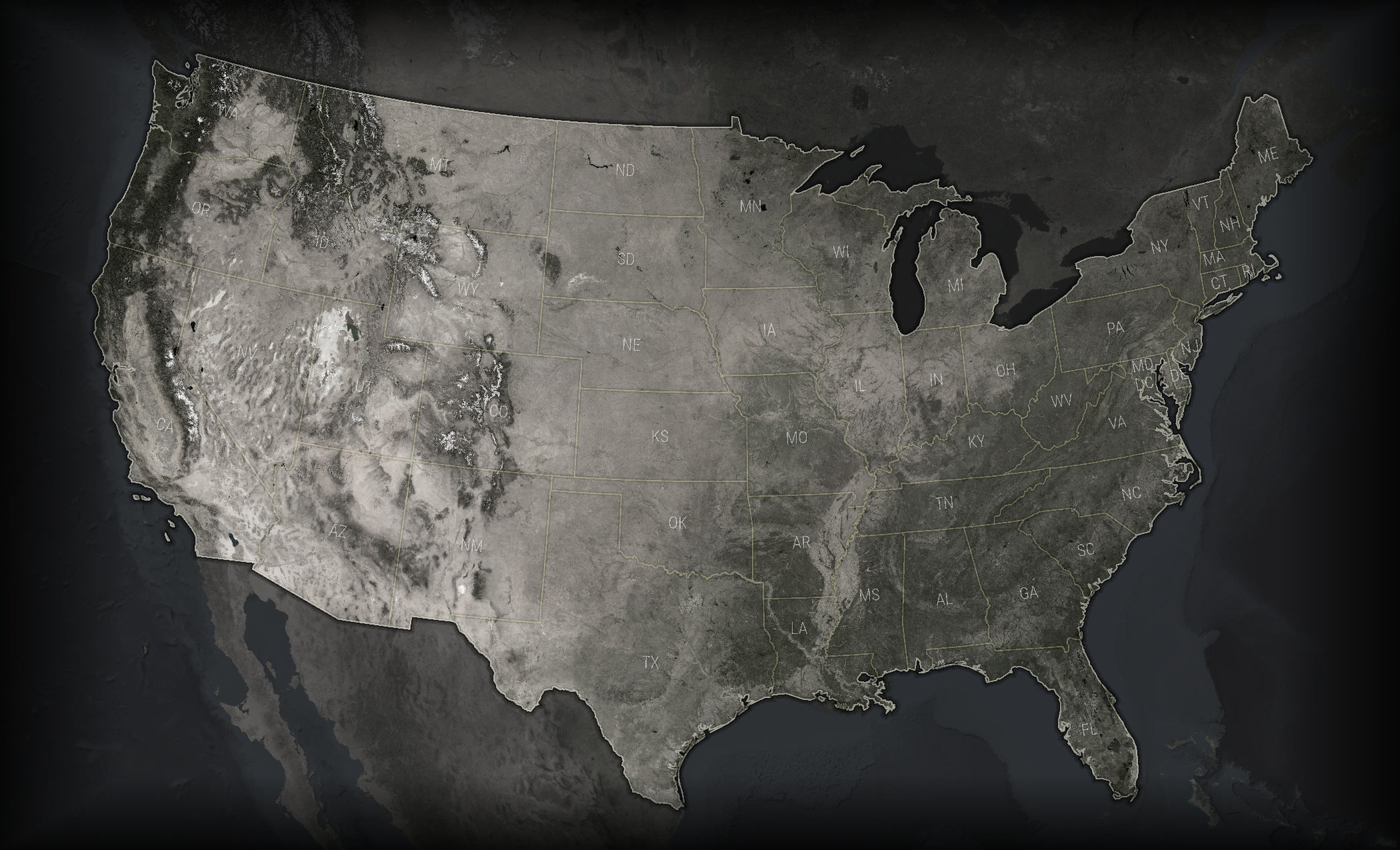
Thematic Data | Color
Here’s the star player. First chair. The reason for this basemap to exist. This is a map of all the military bases in the United States. But there are some interesting attributes about this data that we don’t see when we just use dots.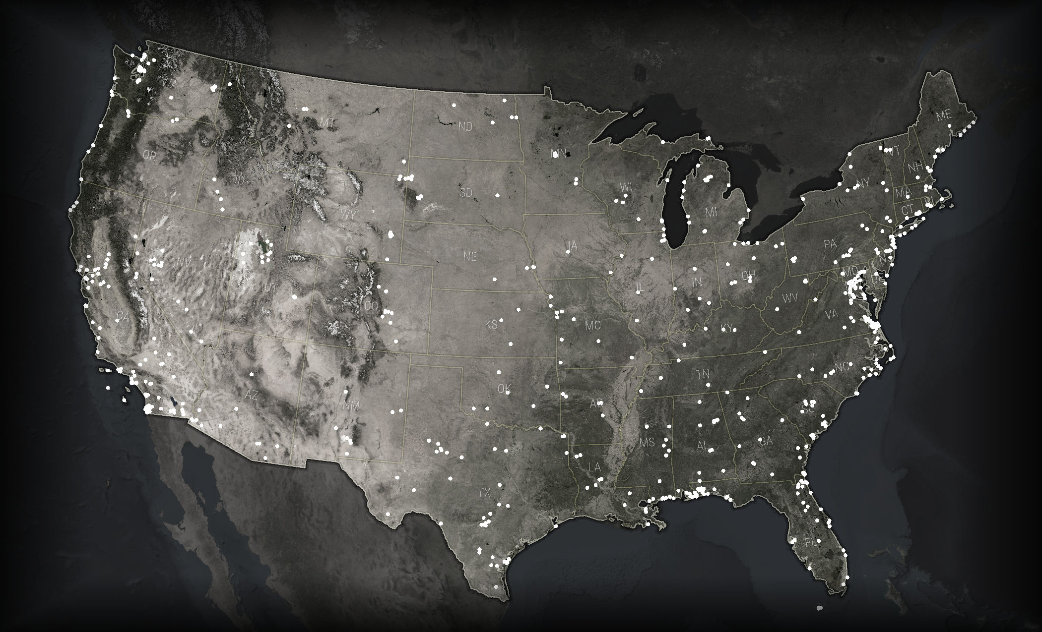
Here are those military installations colored and scaled by their size. Some general rules of thematic cartography:
– If the basemap is dark, the thematic data should increase towards brightness. If it’s a light basemap, the thematic data should increase to darkness. Contrast is the vehicle for communicating prominence. But these are just solid-colored dots.
– Color gradients should not replicate the rainbow. There are plenty of studies that demonstrate how poor of a choice a rainbow color gradient is for continuous data graphics (relatedly, check out this amazing color bonanza). If you stick to the cool end or the warm end of the spectrum for a thematic gradient, stay on that side.
Thematic Data | Glow
What if they glowed?! Here are those same military locations using a glow effect for the point symbol, rather than a solid color. Some notes on glows…
– How: Glows are a radial gradient. The have an abrupt white center (yes, white), followed by an opaque theme color, finally grading to a fully transparent theme color at the perimeter.
– Why: The glow effect, while providing a distinct aesthetic, and perhaps hijacking some primitive cognitive wires, is a fitting example of Waldo Tobler‘s First Law of Geography: “everything is related to everything else, but near things are more related than distant things.” Or, the effect a thing has on its surroundings dissipates with distance. It’s the foundational concept of quantitative geography -and happens to be a convenient rationalization for glowing symbology.
For example, the impact that these military bases impart on their surrounding areas is quite strong on-base, and diminishes as you travel away (air and ground transportation noise, traffic impacts, employment draw to local residents, the visual impact on the land). Things rarely just end abruptly -they make a difference to their surroundings. This is why I grate a little when I see hurricane maps with fine solid crisp one-dimensional lines sweeping out the path of the eye.
While military bases are intentionally evenly distributed, here’s the same method applied to top high school football recruits (themed by player size). 
And here it is applied to the locations of Chipotle restaurants (themed by order of opening).
Thematic Data | Non-Point Geometry
Sure, points can glow, but what about lines and polygons? You can apply the same concepts for other geometry types, as well. It’s maybe a bit more tricky to apply the aesthetic, but the concepts and rational hold for any geometry type. Here are those Chipotle locations aggregated into glowing hexagons (three of my favorite things!). Likewise, the paths of hurricanes and tornadoes, roads, flight paths, pipelines, these things all have a first-law influence on their surroundings. And so they can be justifiably made to glow.
Lines stay white, copies in the thematic color ,increasingly thick and increasingly transparent, stacked beneath.
Polygons can have the same effect applied to their borders, while the fill gets a semi-transparent version of the thematic color.

Closing
Firefly cartography may be over-wrought, overdone(?), overthought, but I like it. And I’ve seen it’s ability to earn a map a thoughtful look in a bloated busy internet; I’ve been encouraged by its tendency to inspire the creative process in others; I’m excited to ride it as a means of teaching cartography to people who didn’t realize they wanted to learn cartography.
It is a crafty, sometimes beautiful, technique that I am happy to promote and excited to describe. I do hope you give it a try and share your results.
Happy mapping! John
Hi John,
This is a great article and I’m trying it out. I’m stuck on ‘Glows are a radial gradient’. I can create a similar glow around points using layered symbology similar to the polygon glow, but is there a way to apply a radial gradient to a point layer? (in ArcGIS Pro or ArcMap 10).
Thanks,
Jimmy
That’s why for points I use a pre-rendered set of glowing dot images.
https://www.dropbox.com/s/6i8uxaxgtbwbkiv/HurricanePointIconImages.zip?dl=0
In Pro you can define a gradient for a point symbol, but it doesn’t appear to support transparency.
That makes sense. I’ve never made custom markers, but I’m going to try it out.
I found that point gradient in pro, but you’re right. You can set one end to No Color, but it shows up as grey. I’d guess Photoshop would do a better job rendering than Arc anyway.
Thanks!
Hi John,
I really enjoyed your talk at NACIS, and you inspired me to make my own firefly map. I then took it to the next level and had it printed on glass for a true glowy look. Here’s my blog post with pictures: http://www.mynameiskate.com/blog/2017/01/11/make-your-firefly-map-really-glow/
Thanks a lot for the guidance!
I love it!
Hey John,
I really love your work. It inspired me to do a firefly map as well. I really like your glowing dots and I’m wondering if you have a qualitative version as well as the quantitative ones you linked above?
I am going to try to make my own but my photoshop skills are pretty weak.
Thanks for sharing your amazing cartography with us!
Hi Ryan! Try downloading this set of glowing point images for your firefly style maps: https://nation.maps.arcgis.com/home/item.html?id=cd048203333f42869c84908884dae411
Really appreciate all these resources John. I’ve reviewed everything Firefly in Living Atlas. I’ve imported the .Png points into my ArcMap style file, and they work! I see the tutorial for light saberin’ in ArcPro. Is it possible to create glow lines for hydrographic polygon/polyline features in Desktop and/or AGOL WebMaps? If the answer is obvious, feel free to volley back a RTFM.
Hi Morgan, thanks for the interest! Yes, you can firefly up polygons. Try out the ones available in the firefly style for Pro: http://esriurl.com/nelsonstyles
In the meantime, it’s the same as the line hack, but with the polygon’s stroke.
Do you do anything to make them cluster together? I’m trying out the technique, and I’m not sure I’m getting the same clustering effect that you have.
Hmmm, not sure what you mean about clustering. Some of these examples show points that are positioned near each other. But the Firefly point style is just a glowing dot, per feature. No clustering algorithm. Just a visual effect of the glowing dots aggregating in visual intensity because they are nearby eachother. No actual computational clustering.
John, how did you “desaturate” the imagery. Did you use some of the Conversion raster functions in ArcGIS Pro, custom image stretch, or some other method? Any advice would be much appreciated.
There are a few different ways you can do this. The easiest way is just to use the Firefly basemap, which is grayscale when zoomed out and more and more saturated when zoomed in.
https://nation.maps.arcgis.com/home/item.html?id=39858979a6ba4cfd96005bbe9bd4cf82
Alternatively, I would recommend using a blend mode. If you add this “global background” layer over the imagery basemap and give it a “color” blend mode, it will make the imagery appear grayscale. If you reduce the transparency of the global background layer then the underlying imagery will look more saturated. You can adjust to your preference.
https://nation.maps.arcgis.com/home/item.html?id=9d87b96d48714e7ca9c89ab63f2c3cd7