***
This method has been used more recently to map the past six months of drought afflicting the southeastern United States.
***
Maps
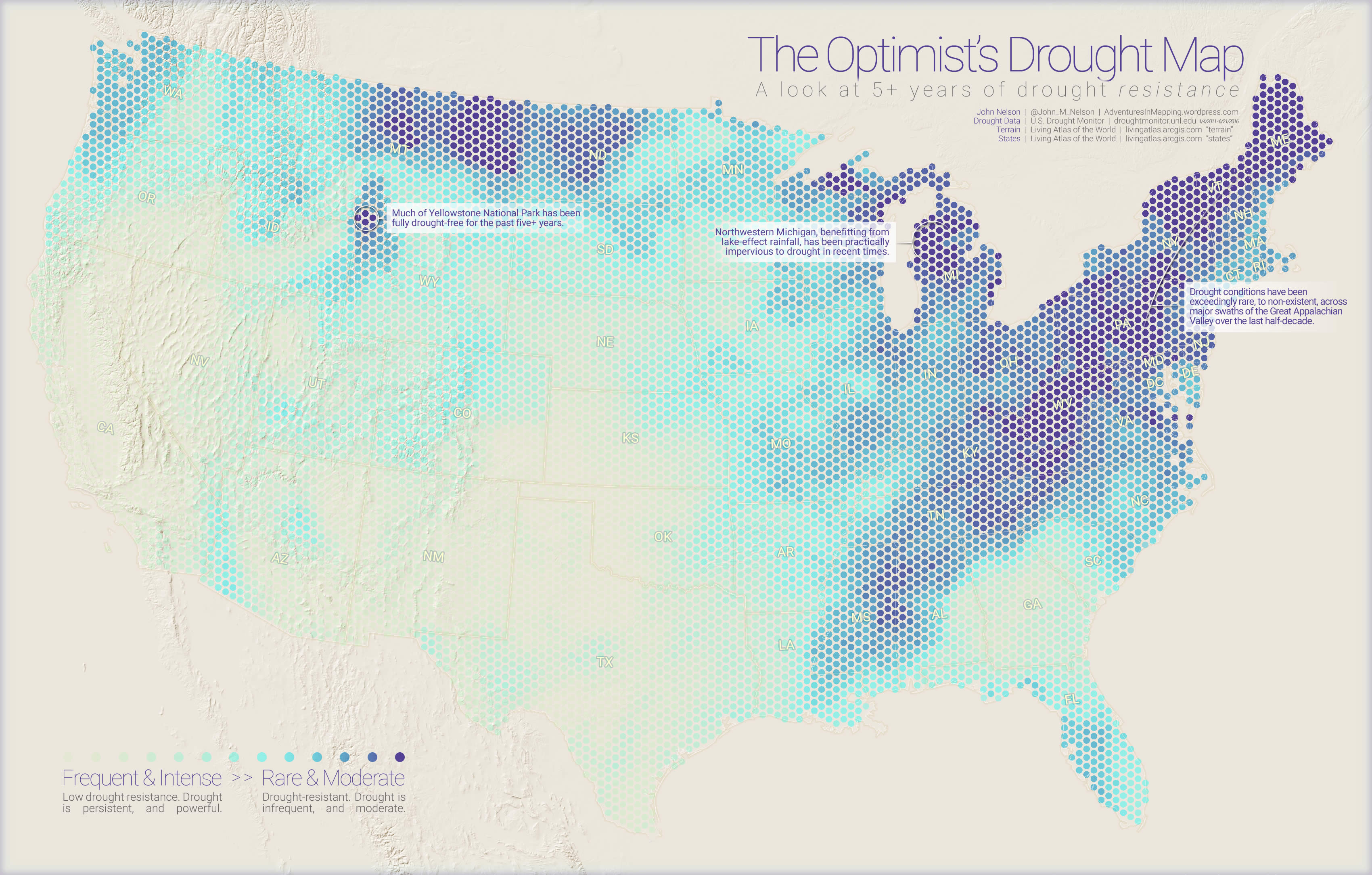
This is a map showing over five years of drought data (285 weeks, combined into a single view) in the United States.
The dots are proportionally sized by the amount of time over the past five years spent in drought (the largest dots representing 80% – 100% of the time), and the color is a weighted value of the overall intensity of those droughts (deep purple indicates frequent “exceptional” drought, the most severe category).

Initially, when I had aggregated the 285 weeks of drought boundaries into a single view, I was just curious what it would look like. So I piled them all together, and gave each week’s drought boundary an opacity of just 1% (99% transparent). The result was a map that accidentally characterizes the movingness of droughts over five years by using opacity to represent motion.

When I shared the early versions of these maps on Twitter, the nature of the phenomenon was, understandably, a bit of a bummer. But, as a wise mentor once told me, the absence of data is data. So, if you want a more positive spin on this thing, here is a map using the exact same source data, just run backwards through the sausage machine.
And all together…

Drought
This data comes from the tremendous, ongoing, work of David Miskus in a partnership between the National Drought Mitigation Center at the University of Nebraska-Lincoln, the USDA, and NOAA. The U.S. Drought Monitor focuses on broad-scale conditions to draw, every week, a map of varying degrees of drought in the United States. For the maps above, I aggregated D1 (the least intense) through D4 (the most intense) from January of 2011 through June of 2016. Here is a description of the generally horrible crap that characterizes these drought levels:
D1
- Some damage to crops, pastures
- Streams, reservoirs, or wells low, some water shortages developing or imminent
- Voluntary water-use restrictions requested
D2
- Crop or pasture losses likely
- Water shortages common
- Water restrictions imposed
D3
- Major crop/pasture losses
- Widespread water shortages or restrictions
D4
- Exceptional and widespread crop/pasture losses
- Shortages of water in reservoirs, streams, and wells creating water emergencies
There are places in the United States that have been experiencing drought conditions non-stop for longer than five years. Other places have been at a D4 level for a majority of that time. Sustained drought is not just a seasonal artifact, but has lasting effects on the hydrology of a place, and its ecosystem.
Here is a quick map of all the D4 drought over the past five years. Each week of D4 drought has an opacity of just 1%. The really dark patch around Electra, TX, has been at D4 more often than not.

Visualization
Time can be a puzzling thing to represent in a single static map. But there are also lots of social and cognitive benefits to communicating time in a non-animated way. Sometimes glomming everything together into a single view, can be just the ticket. But how to glom?
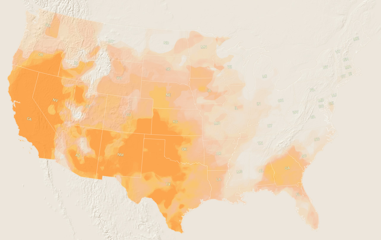
Here is what all of the raw data looks like, just slapped one over the other.

It looks interesting, but not a lot of takeaways from a map like this. The problem of overlapping data means that some areas are just maxed out and I can’t get any visual variability within the really problematic drought zones. Also, there is just no way to quantify any of this. What if I separate out the Drought levels?

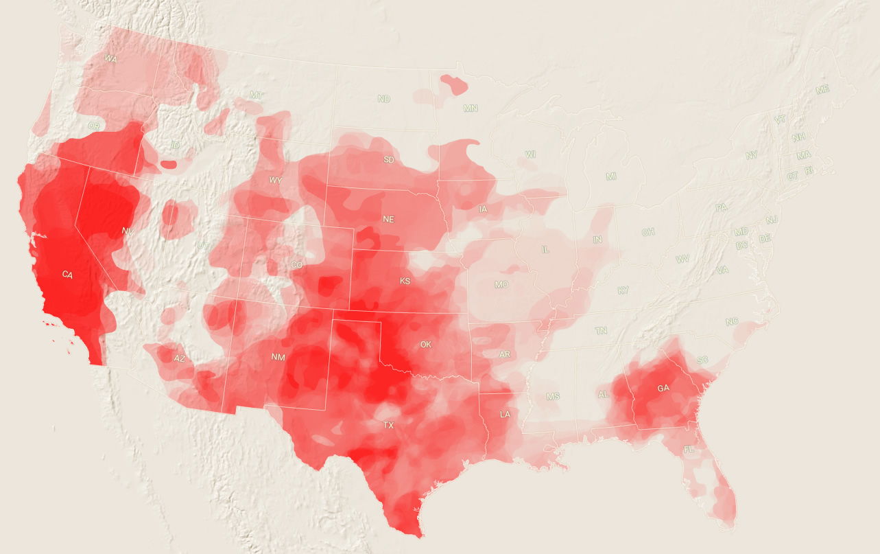

Interesting, but now I have to look across four separate images and compare them in my leaky working memory. And I still didn’t solve the problem of occlusion, or my inability to squeeze any hard stats out.
Time to lump these suckers into bins! I can count things in a bin. Here is a hexagonal mesh draped over the US. Now I can run a “join by location” to count up all the drought zones that hit the middle of each little hexagon. Bring on the numbers.

Now that I have numbers, nice beautiful numbers, I can do all sorts of thematic shenanigans to this map. Time to quantify! Here is a color-coding of the hexagon cells by a weighted sum of the number of weeks that it experienced drought (worse droughts count more, etc.).

But oftentimes I find myself wanting to be more like Kirk Goldsberry. And he doesn’t just color in hexagons, he scales them! But scaling an area is hard. Fortunately, scaling a point is easy. So here is a map where I converted all the hexagon polygons to their center points.

Now I can easily make a scaled symbol map. Here is a map showing the proportion of time each location has experienced any drought over the past five years. (0-20%, 20-40%, 40-60%, 60-80%, 80-100%).

But you can have your cake and eat it too. Here is a map where I broke those five classes of dots into their own layers (% of time with any drought) and color coded them by the good old weighted drought severity value from my original polygon map. This is a bi-variate map, because I am showing two values (size by frequency and color by severity) at once.

If you want to play with this data yourself, here is the point shapefile used to make the bi-variate map. Happy mapping!
Here are the three main maps, in a unified layout. If you’re into that sort of thing.
Cheers, John Nelson
This is great! How does one go about making something like this? For example with deforesteration in Brazil, appreciate any help!
What do you mean? Do you have data?
Looks great! What tech did you use to do this?
I used ArcGIS Pro. It’s mapping software. Because I loves to make the maps.
Thanks for a very interesting post and funny way of explaining Things
Thanks Michael!
I would love to see a tutorial of how to do this kind of maps, or at least of you did these ones.
Crap, I sort of thought this was a tutorial. But maybe I could be more specific about the procedure in a follow-up post?
Awesome post and responses! We’re trying to figure out how to map kangaroo presence/absence in Australia over time, along with shooting data, drought, and habitat loss. Tricky. But this was a great page to happen upon. Thanks!
This is super impressive! I’ve only just started on ARC GIS, so the thought of making something like this boggles the mind. Thanks for detailing your thought process as you went through the iterations.
Thanks Justin! I encourage you to give it a try, it’s all very doable. I’m planning on a more specific guide on how to aggregate overlapping polygon data into a hex array like this. I hope you check back. In the meantime, happy mapping!
Damn that’s very inspiring. Many thanks on sharing your method. I’m a undergrad student on environmental engineering down here in Brazil, GIS affictionated and QGIS user. Check out mine preliminary result inspired by your map: (color theme is average income and total population is the size) https://drive.google.com/file/d/0B7Vk–czrTUsc09LdlBBdUpqLTQ/view?usp=sharing
Great map! Thanks for trying it out and sharing your progress.
Hey John, congratulations for this great post!
Do you think it is possible to do the same work using open source tools like Qgis or R ?
Thanks
Why not?
This is wonderful and I was able to do something similar with regards to this technique, but how did you create your legend? I would believe that it would need to be a custom legend?