To my eye, calm, clear, seas have a distinct look to them. A shallow aqua that deepens to blue. The gradual reduction of seafloor clarity at greater depths. A faint web-like reflective surface.


But maps that I see of the oceans, or deeper waters, don’t really look like that. For all the efforts in getting brown-to-green terrestrial colors and textures just so, the glassy, translucent, semi-transparent medium of the oceans seem neglected by comparison.
Here is a How-To for creating some oceanic cartography for the sheer aesthetics of it, which you can take for whatever it’s worth.
A hillshaded surface is the first step in getting a rich texture to underpin the bathymetry we’ll use in the following steps. Feel free to just get lost in the awesome never ending world of terrain mapping, whether it’s above or below the waterline.
In the image below, I’ve pulled in an image service from ArcGIS called “TopoBathy Hillshade.” It’s a beautiful “multi-directional” (blended angles to replicate the diffusion of atmospheric and reflected light) surface.

Of course, as a decent human being, you will chose your own color range to apply to this data, thanking the default for doing it’s good work then rushing past into the domain of active participation. For our purposes, we’ll make it an earthy tan range -like a drained quarry!

There we go. Now instead of a cold moonscape, we have a dire post-apocalyptic mud planet. From this angle, you can look down at the Mid-Atlantic Ridge, with North America to the left and Euro-Africa to the right.

The other side of the world has a lot more undersea variability, which will help guide our choices when we bring in the bathymetric layers, so I’ve spun around to that for reference. That series of u-shaped trench-looking things is actually a u-shaped series of trenches, including, conveniently, the deepest undersea location on Earth!

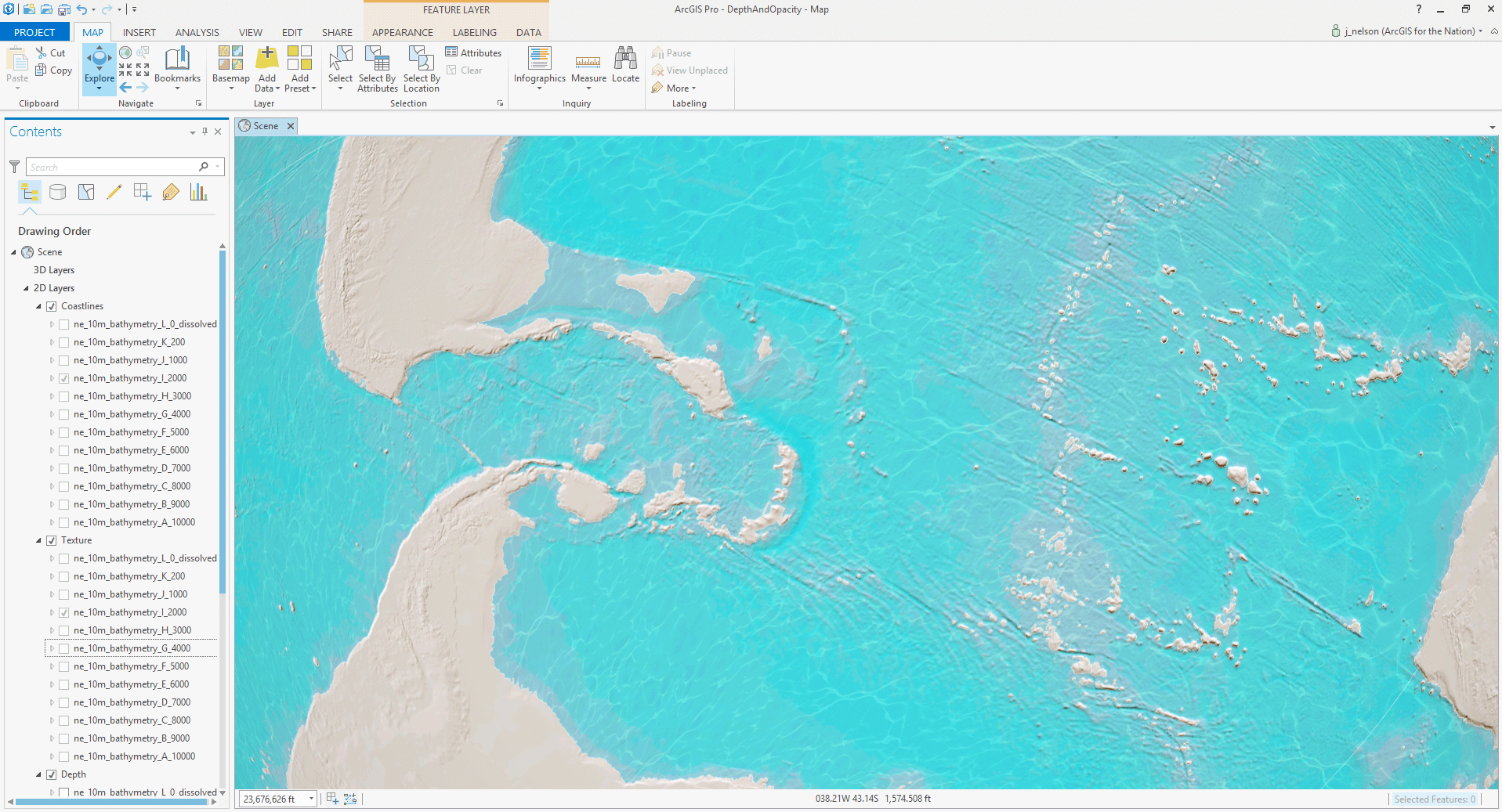
Here, I’ve pulled in a set of bathymetric polygon layers from Natural Earth. I’ve colored them in the standard cartographic ramp of darker blue to lighter blue (an additive process where deepest layers are drawn on top of shallower layers). It’s a convenient trick, but the flat, fully-opaque nature of this view A) doesn’t really do justice to the trippiness of water and depth, and B) covers up the awesomeness of the seafloor texture with a cartoonish vector treatment that doesn’t jibe.

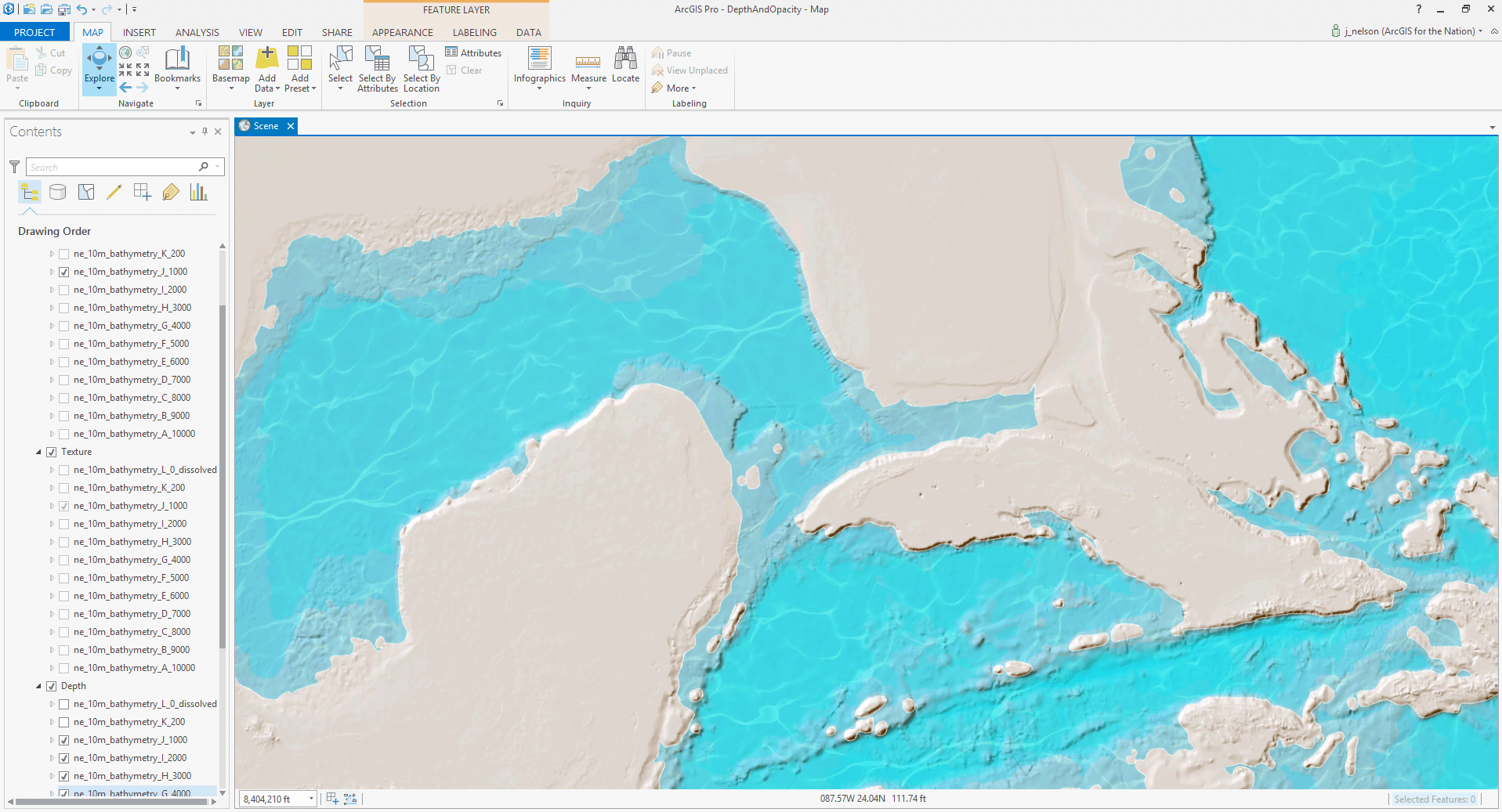
Here is a quick and dirty transparency applied to all of the bathymetry layers. Each layer is 75% transparent (15% opaque). I’m liking it!! It has a milky diffusion that more directly illustrates depth -shallow seafloors showing through more strongly with deeper areas pooling up a greater opacity.

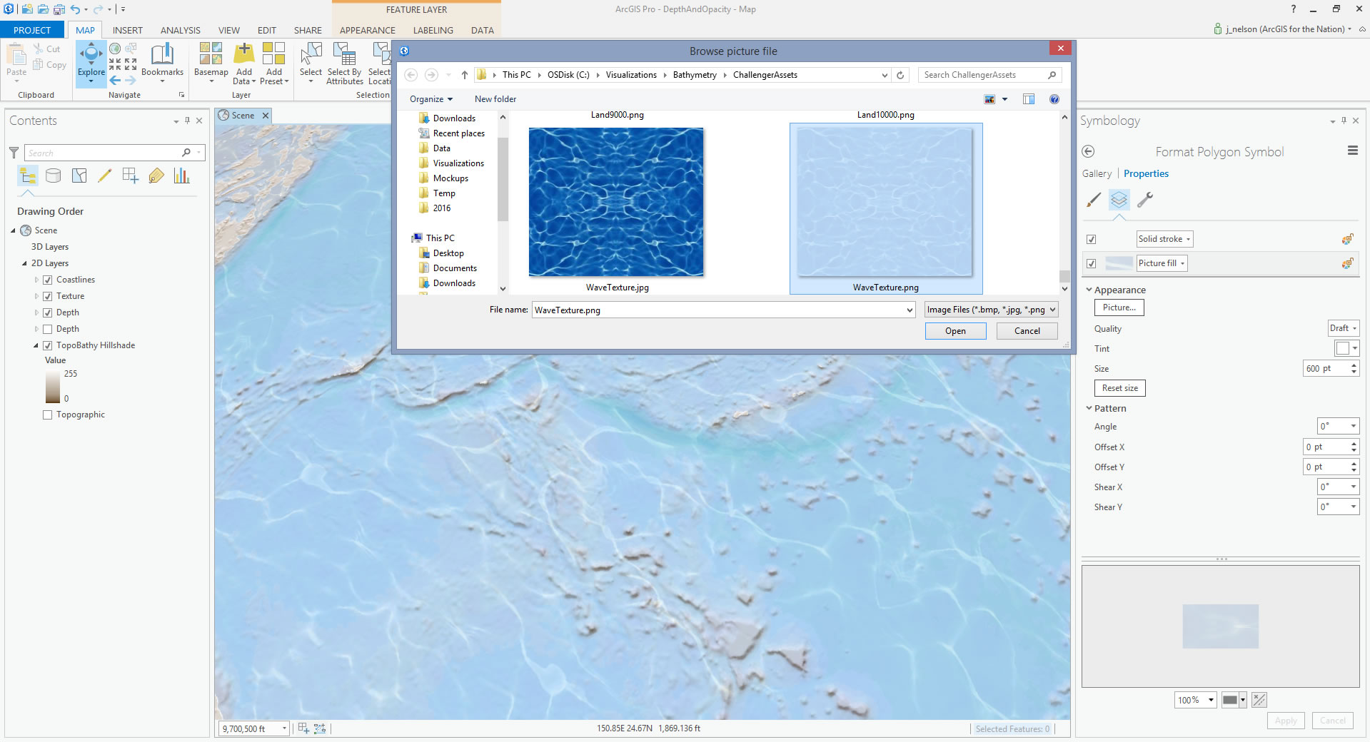
Well, while we’re at it, let’s add in a gratuitous reflective surface! Don’t judge me, you knew this was about over-the-top cartography from the outset. Here is an image of a pool’s shimmering surface on a sunny day that I’ve copied-and-flipped horizontally and vertically so that there are no seams when it tiles together. Sure, it looks like a Rorschach test now, but that should break up when duplicated over a varied surface. This is the exact image I used, by the way (right-click > “Save image as…” to steal it).

I duplicated the top-most bathymetry shapefile (sea level) and rather than a semi-transparent color fill, I’ve chosen “Picture Fill” to use as a surface texture. You can adjust the size of the image tile to get a scale that suits you. Note, if you adjust the “angle” of the picture fill, it goes a long way to breaking up the appearance of a repeating pattern that wrecks your illusion.
Additionally, I’ve duplicated the top-most bathymetry layer again, and gave it a hollow fill and a white stroke to help in coastline demarcation.
Looking real-ish! But, the muted blue cartographic color range isn’t holding up well enough at a reduced opacity. And it’s not looking as tropical as I wish from here in my mid-March Michigan setting.

So I punched it up! Rather than the standard pale blue to slightly less pale blue of a typical (opaque) bathymetry map, I’ve increased the saturation and pushed the blue closer to a cyan in the shallower layers (#00FFFF to #00D2FF). To me, this is starting to look less like a GIS project and more like staring at a photo of a shallow pool.


But it IS A GIS! Which means you can delve into terraforming, and grin confidently while you do it. Since you have all the layers representing your additive depth, you can peel back those layers (remember to show the reflective and coastline layers for only the topmost depth you want to illustrate -take a close look at the table of contents in the images below to see what I mean).
Here’s a small multiple set of screenshots illustrating hypothetical scenarios of reduced ocean depth…


…which of course you can drop into an animated GIF! Because it’s 2016, and the web still goes bananas for animated GIFs!

That’s it, for starters. But you aren’t satisfied with just starting. What would happen, you wonder, if instead of only showing the topmost layer’s water texture, you show water textures all the way down?! It’s a fun effect. Especially when panning around in a 3D viewer (I slightly decreased the texture size for each layer so the pattern wouldn’t stack up on itself).

Here are some fun views of the Earth with the oceans partially drained. The world is a beach.

One thought on “Carto Hack: Mapping Water Depth with Opacity”