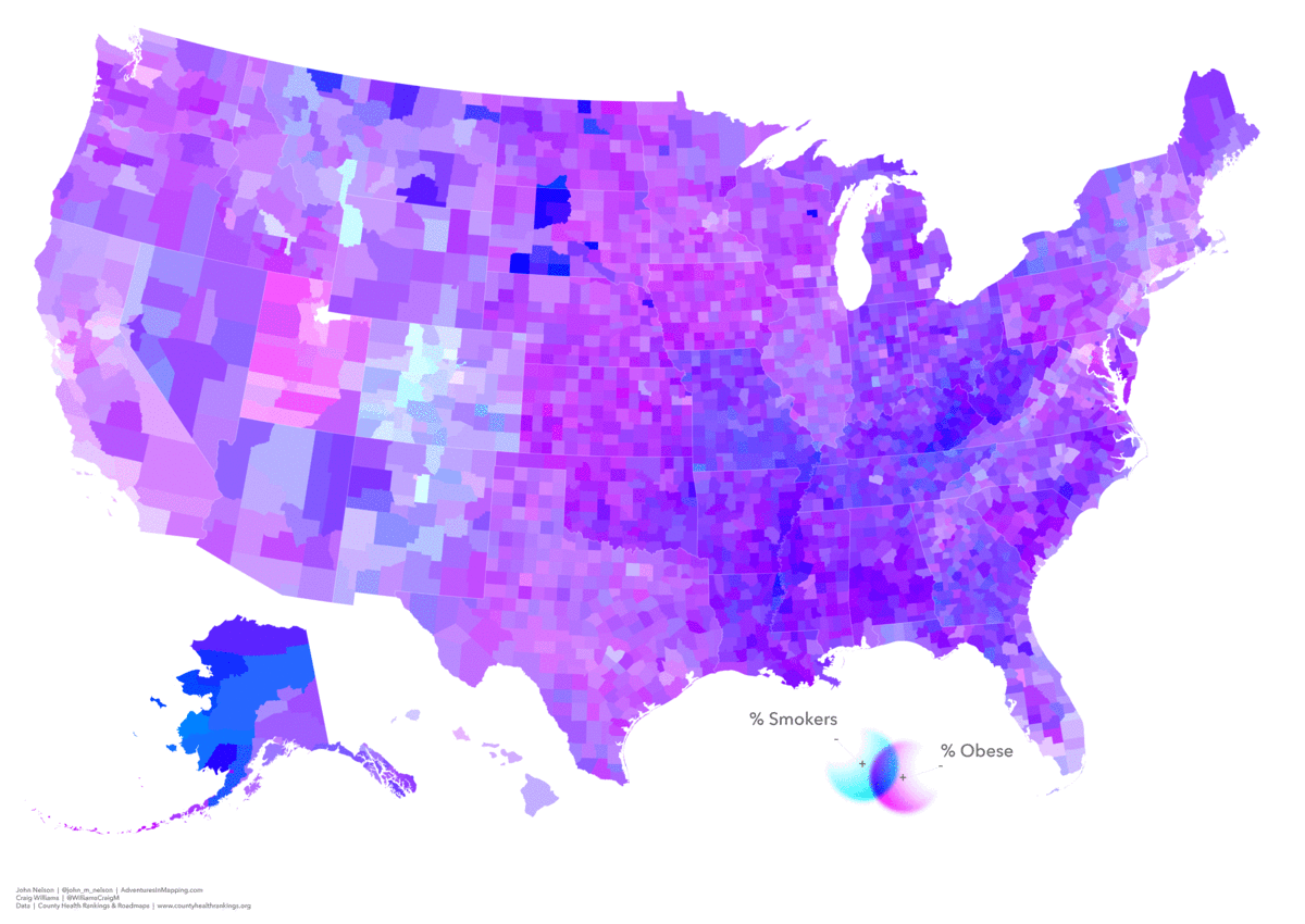
This map uses the CMYK subtractive blending method to encode the rates of Smoking, Obesity, and Excessive Drinking into a single map. The source data tables come from the County Health Rankings & Roadmaps program and is available in geographic form here.
It’s a lot to chew on. I’ll discuss below…
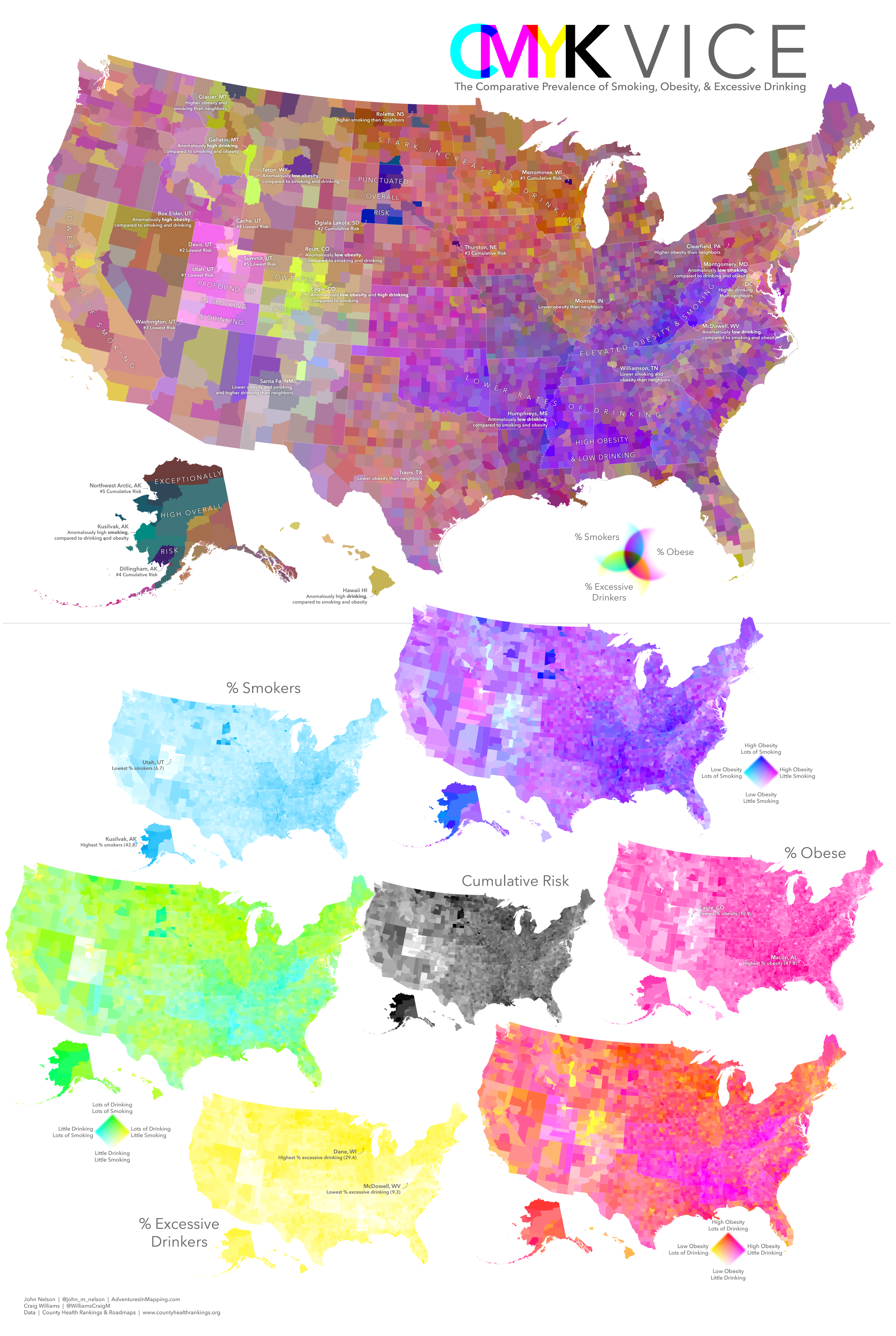
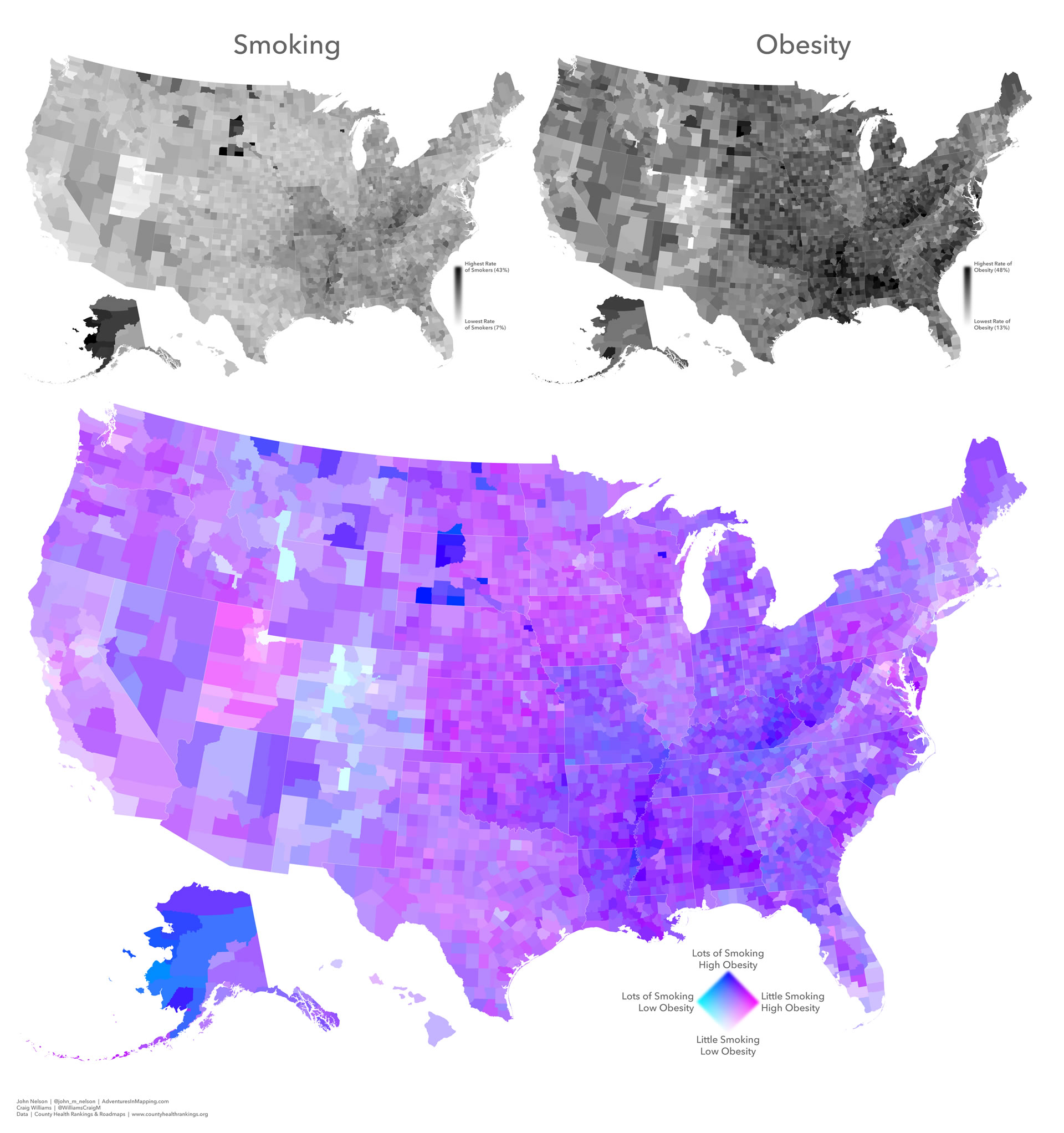
The topmost graphic is a trivariate choropleth map attempting to show the relative relationships between three health factors, at once. The purpose of any multivariate map is to tease out a relationship between the phenomena. Usually we’re just dealing with a bivariate map that compares two variables. But adding dimensions to the visualization has a multiplying effect and things get nuts in a hurry.
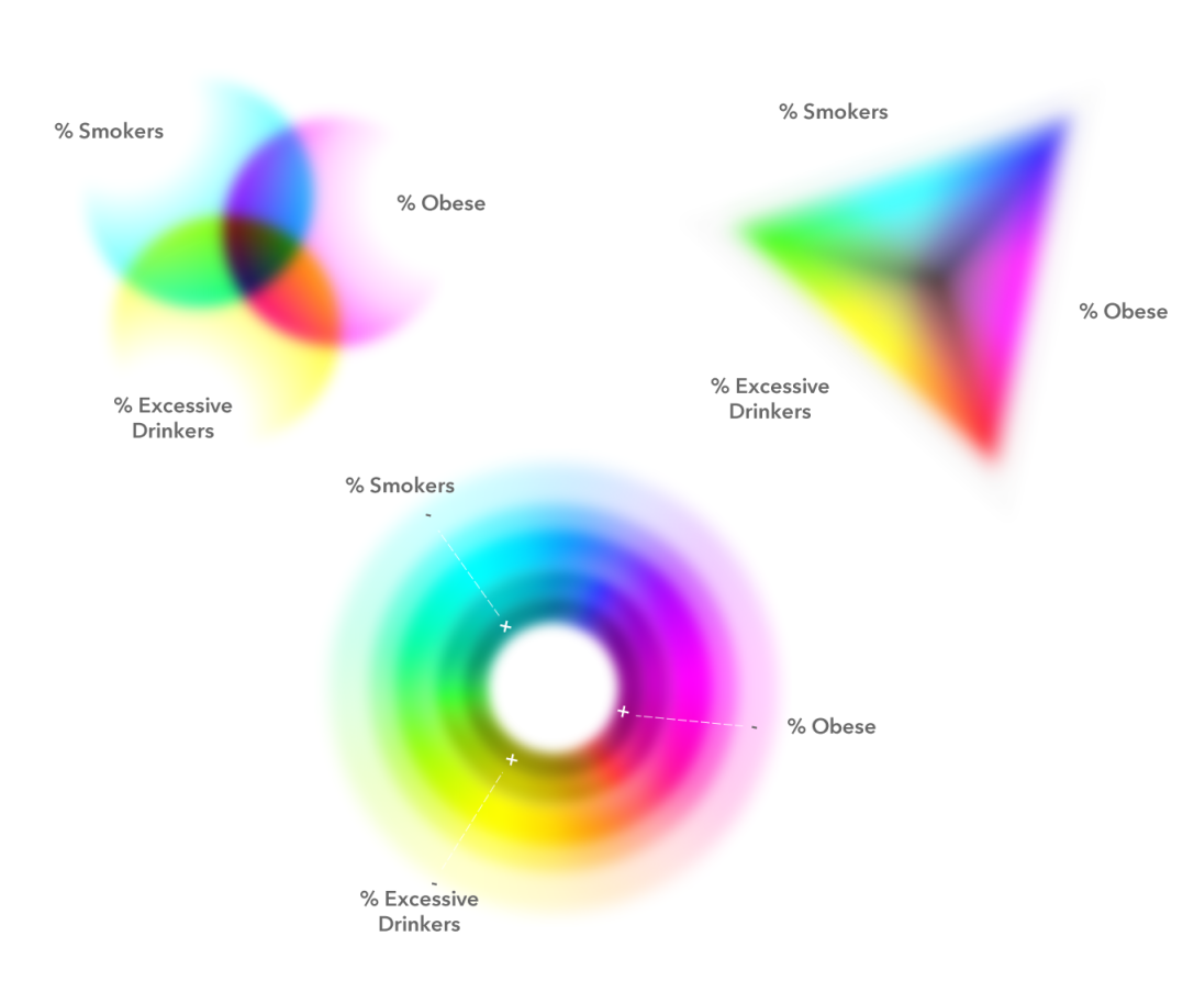
If you find yourself working in the CMYK color space from time to time, then you’ll recognize the color scheme of this map is the same used in process printing to generate pretty much any color, based on the proportion of cyan, magenta, and yellow (also “key” which these days is black). If you a designer or illustrator your mind will have some practice in understanding, interpreting, and predicting the array of colors possible via the variable amount contributed from the three component colors. It’s a subtractive process, unlike TVs and monitors (which turn on color channels to create brightness and whiteness), more ink covers up the white background. Also, I admit, it is largely inaccessible to those with any type of colorblindness.
And it’s still pretty hard everybody else. I swim most days in blended pools of cyan, magenta, and yellow and I still struggle to make immediate sense of the topmost map. But that’s ok. I’ve asked a lot of that one map and I’ve asked a lot of anyone that might try to interpret it. It is possible, though, with a bit of time and exploration. For example, how do you make a 2D legend for something that has to three (or is it four) color dimensions? There’s probably all sorts of ways, but none are perfect. Here are a few…
Why bother? I like to think about the edges of cartography and what the trade-offs are for various techniques. Even if something isn’t ideal, I feel like I learn a lot from the process of poking the fence.
Anyway, enough chit chat, let’s see if we can make any sense of this thing. I can see pockets of lighter and darker ink at the national level, which represents the overall variability of all these health factors combined. But immediately my eye is drawn to the pinkness of Utah and the yellowness of its neighbor Colorado. I mean, you see that, right?

You would be forgiven for thinking that Utah has a problem with obesity, but their rates aren’t especially high. What we’re seeing is what’s left when almost no one in the state smokes or drinks (save the steep uptick of drinking in Salt Lake Co.)! Similarly, Colorado, which only has a marginally high rate of drinking, has incredibly low rates of obesity.
And I can start to tease out tracks of deep blue in Appalachia and the cotton belt…

This color illustrates low rates of drinking (almost Utah levels) but higher rates of smoking and (really) high rates of obesity.
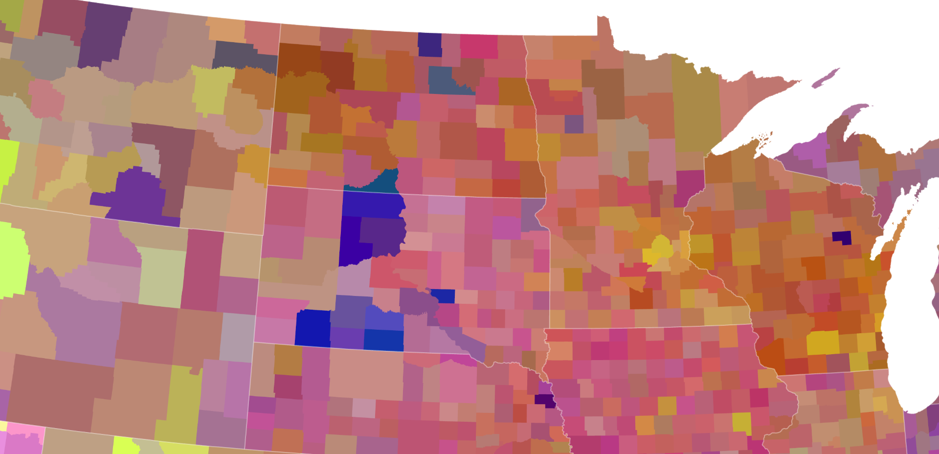
The state of Wisconsin, and pouring northwest into Minnesota and North Dakota, are awash with much higher rates of excessive drinking than the other risk factors and higher rates than much of the nation.

There are a few punctuated counties of the upper Great Plains with exceptionally high overall risk, particularly smoking. When I looked into them, I learned that they correlate strongly with Native American reservations, highlighting difficult health challenges in those communities.
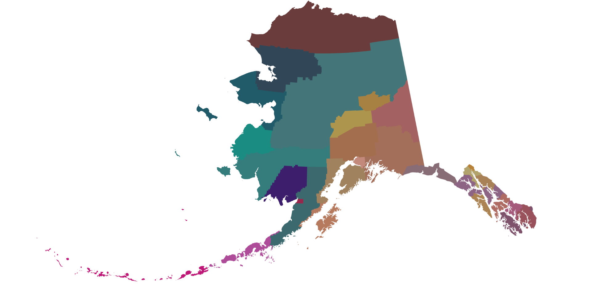
Similarly, much of Alaska is home to an undue portion of ink. While the relative proportions may vary, the state is home to overall high rates of all three measures.
Breaking Out
Efficiency vs complexity is the trade-off of any visualization; encoding ever more information into a visual will likely require more effort from its audience. If you are feeling bold, then information-dense data products can be an interesting avenue. But if you’re (probably rightly) concerned that the singular result could use some helpful context, there’s nothing wrong with creating a family or series of supporting graphics that focus on individual facets and buttress the overall visualization.
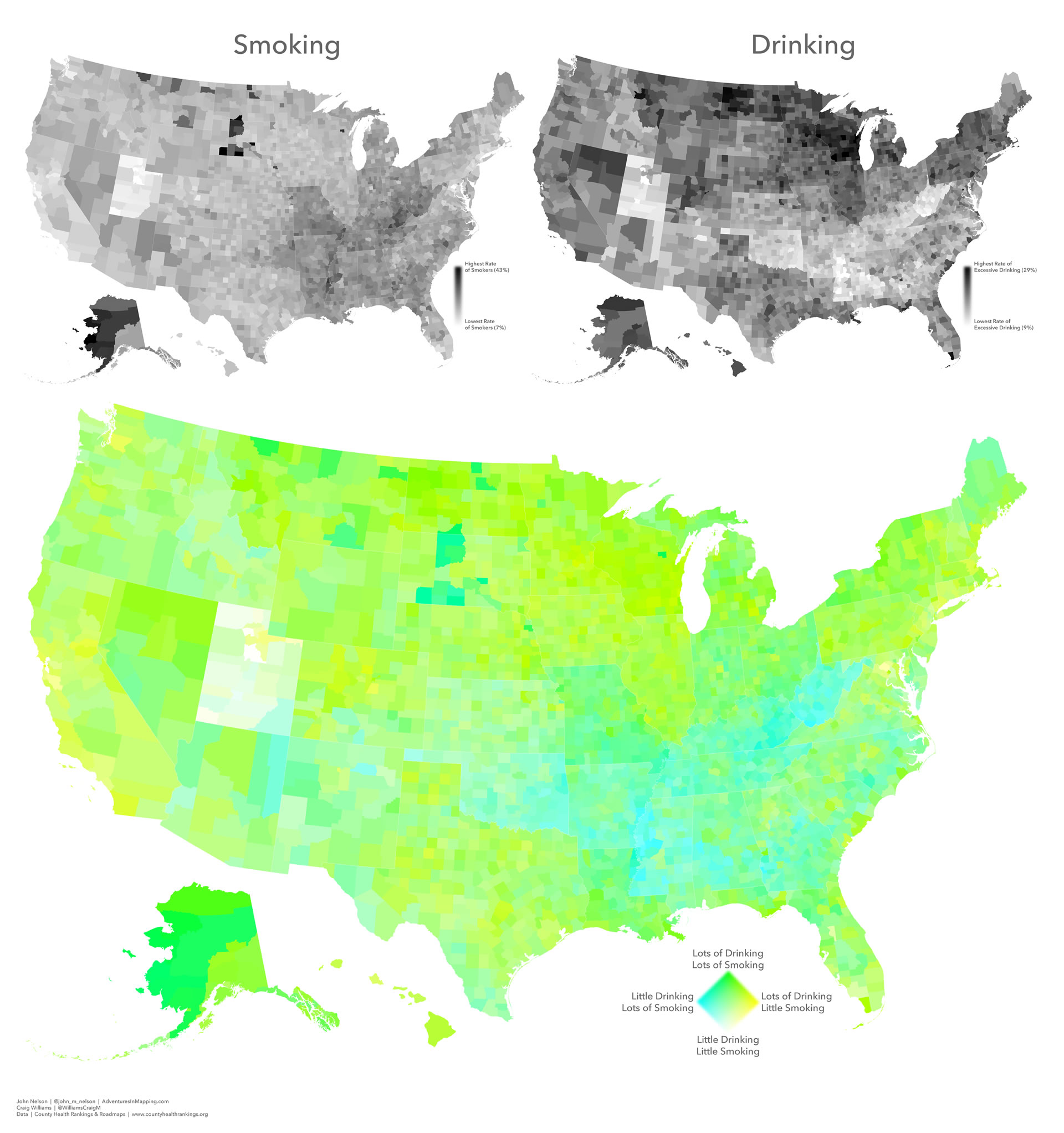
So rather than (or in addition to) a map that shows three measures at once, you can opt for three maps that compare these measures two at a time. These are bivariate maps. While still pretty complex, they are nowhere near as brain-busting as the trivariate map. But there are three of them, and they can only show relationships two at a time.
…

…
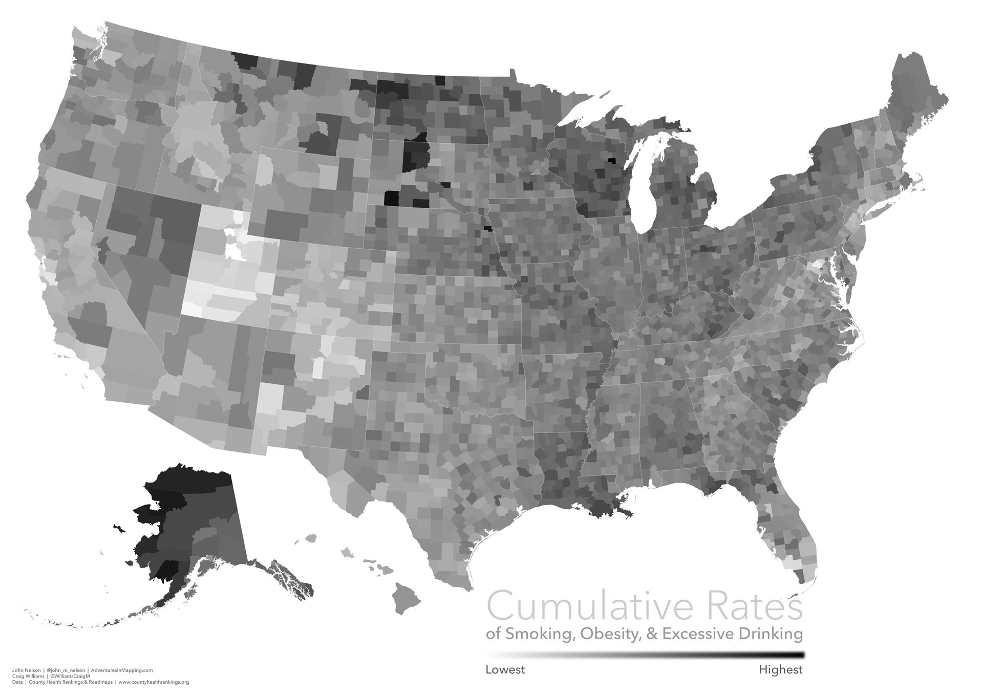
These three bivariate maps can be visually tied together with a reference showing the overall cumulative rate of smoking, obesity, and drinking…
Animation
Since we’re poking the edges of what’s practical anyway, why not consider ways of gaining some benefit of the fully blended trivariate approach but with the three somewhat more comprehensible bivariate maps?
Here is an animation cycling between the three phenomena but only blending two at a time…
Bonkers? Yes. But hey, I already had all the assets, so why not throw it against the wall, see if it sticks for some folks.
Since we are breaking the seal on animating constituent maps, maybe we can take another step back and just animate the three phenomenon maps (unclassed, transitioning from lowest value to highest value), hoping our working memory can run hot for long enough to draw interesting comparisons within our minds…

Trivariate Thoughts
Trivariate maps are complex. Look at all the bivariate and univariate and animated alternatives just to approach the same nature of the original. And there are still dimensions of comparison that are only possible in the trivariate map. Is it useful? It can be, with effort, and then only with a lot of call-outs, legends, and supporting maps. So you can take that for whatever it’s worth.
Here it is once more so you don’t have to scroll all the way to the top of this surprisingly long post.
Happy Map Thinking! John
PS: I’ll be following up with an interactive version (so you can find your county’s stats) and a how-to post for converting three separate variables into a layer’s CMY color channels. Get ready to live.
PPS: Explore an interactive version of this trivariate map here, where you can get the lowdown on each county’s rates.

Interestingly, the drinking/obesity map would appear to indicate high rates of drinking/low obesity (pink) through the Appalachia/Corn Belt region where the trivariate shows the opposite to be true. I can’t imagine how the data would misrepresent itself in this way. Thoughts?
LikeLike
In that bivariate relationship pink would indicate higher rates of obesity and lower rates of drinking.
LikeLike
Turns out my legend was wrong. I’ve updated it with the correct labels. Good eye!
LikeLike
I believe the legend is backwards for the obesity/drinking bivariate. I love these maps!
LikeLike
Yes, you are right! Fixed now, thanks.
LikeLike
beautiful maps! I wonder how poverty rates would interact with smoking/obesity/drinking rates…
LikeLike
Good questions. The good news is you can find out for yourself. Here’s the data: https://www.arcgis.com/home/webmap/viewer.html?useExisting=1&layers=c2d611adace94b488bfbf280dd591a7c
And then you can compare whatever data you like. Here’s a how-to: https://www.esri.com/arcgis-blog/products/arcgis-enterprise/mapping/how-to-make-a-relationship-map-in-arcgis-online/
LikeLike
Very cool! I really enjoyed looking through these maps and especially noticing the interesting changes across state lines. One correction: the outlier county in Utah is Summit, not Salt Lake. Summit County is where Park City is, and it has a much higher rate of people who live there for skiing/outdoor recreation and/or second homes for rich people (not sure how that is counted in the data). It is much less LDS than the rest of the state. Salt Lake County has a higher rate of drinking and smoking (and lower percentage of LDS church members) than other counties in Utah, especially Utah County, where Provo and BYU are, but it’s not as big an outlier.
Signed,
A Utahn
LikeLike
This is a truly excellent use of public health data. I am currently writing a masters paper on Geographic Information Systems and their use in healthcare and I was wondering if I could have permission to use your graphic in the paper? It would be private between me and my instructor. Let me know. Thanks!
LikeLike
Absolutely Ryan, have at it!
LikeLike
These are very cool – How did you create the legend for these maps??
LikeLike
yowza, it was a lot of playing around in Adobe to get something that balanced accuracy with simplicity.
LikeLike